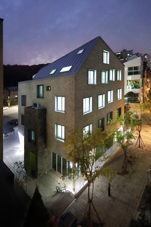
Text description provided by the architects. This residential building is located in a newly developed urban area where buildings of similar height and area have recently been built according to neatly planned layout. The site area of this project faced three sides to the road, meaning all four facades of the building equally important.
In designing the building the architect took into consideration both the disposition of it in relation to other buildings, and its role as a space of human contact, since the client had the plan to run it as a guest house in the future.
The witty window arrangement adds unexpected rythm to the exterior .While the color tone of the outer walls is calm, the window frames bring in a sense of movement. Windows were also arranged this way for an important function. By having small, divided windows rather than a large picture window, the internal space can be used flexibly according to future changes to the business plan by means of additional walls or partitions.
The roof was designed to maximize both the visual and functional roles. The small opening on the roof-top of the building allows the dwellers close contact with each other and with the sky. Angular lines were applied to the roof so that the four facades of the building can tell different stories despite the fact that they all have a consistent literature written on them. From a certain point of view the roof line provides eye-catching sudden cut-out element, and from another point of view it takes on a rather unprovoking, traditional look.
The fourth floor consists of a high-ceiling living and gathering space, a kitchen, and two atticrooms hidden under the dynamic roof of the building. This space acts as an accommodation for the dwellers with a family-like mood, something highly valued in the S. Korean culture. This space makes the building something more than usual apartment buildings commonly found in this area.
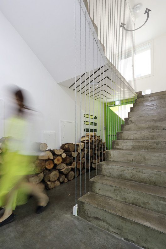
The vivid lime color has a number of important roles. It acts as the linkage that holds together the exterior and interior of the building, and provides an emotional identity. It also is another witty, graphic element that the dwellers can simply enjoy.